
@node-projects/pickr-webcomponent
About this fork This repository is a rewrite of simonwep/pickr as native web components. The original project is frozen upstream — see the note in its README. This fork keeps the look and color logic of pickr but drops the monolithic
Pickr.create({el})API, the popup/positioning engine, SCSS, and the webpack build. The three themes are now standalone custom elements with shadow DOM andadoptedStyleSheets, shipped as plain ES modules.Credit for the original design, color math and SCSS goes to Simon Reinisch and pickr's contributors.
- 🧩 Web components —
<pickr-classic>,<pickr-monolith>,<pickr-nano> - 🌑 Shadow DOM — fully encapsulated, styles applied via
adoptedStyleSheets - 🚫 Zero dependencies — no bundler, no framework, no build step
- 🎨 Three themes (classic, monolith, nano)
- 🌈 Multiple color representations (HEX, RGBA, HSLA, HSVA, CMYK)
- 🔍 Color comparison (current vs. previous)
- 🎚️ Opacity control
- 🖱️ Detail adjustments via mouse-wheel
- 👆 Touch support
- 🎨 Swatches for quick selection
- ♿ Accessible with keyboard navigation and i18n
- 🪟 No popup — the component is the picker; you place it wherever you want
Breaking change vs. upstream pickr The old jQuery-like
Pickr.create({el})API is gone. Pickr is now a set of web components that render inline. Positioning, popups, toggling and click-outside are no longer handled by this library — wrap the component in your own dialog, popover or drawer if you need that behavior.
| Classic | Monolith | Nano |
|---|---|---|
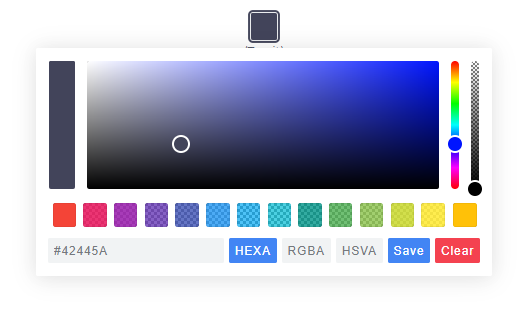 |
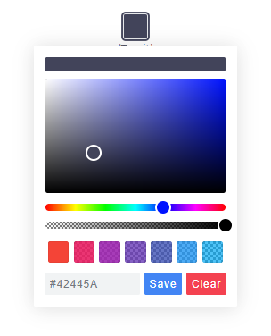 |
 |
npm install @node-projects/pickr-webcomponentNo bundler needed — everything ships as plain ES modules. Styles are inlined into the components as constructable stylesheets; there is nothing extra to import.
<script type="module">
  import '@node-projects/pickr-webcomponent';
</script>

<pickr-classic default="#42445a"></pickr-classic>
<pickr-monolith default="#ff3366" lock-opacity></pickr-monolith>
<pickr-nano default="rgb(34, 139, 230)" swatches="#f00,#0f0,#00f,#ff0"></pickr-nano>import {PickrClassic} from '@node-projects/pickr-webcomponent';
const el = document.createElement('pickr-classic');
el.config = {
default: '#42445a',
swatches: [
'#f44336', '#e91e63', '#9c27b0',
'#673ab7', '#3f51b5', '#2196f3'
],
components: {
preview: true,
opacity: true,
hue: true,
interaction: {
hex: true,
rgba: true,
hsla: true,
input: true,
clear: true,
save: true
}
}
};
document.body.appendChild(el);
el.addEventListener('change', e => console.log('change', e.detail));
el.addEventListener('save', e => console.log('save', e.detail));
el.addEventListener('cancel', e => console.log('cancel', e.detail));<script type="module">
import 'https://cdn.jsdelivr.net/npm/@node-projects/pickr-webcomponent/lib/js/pickr-classic.js';
</script>
<pickr-classic default="#42445a"></pickr-classic>Every component supports the following attributes. All are reactive — changing an attribute rebuilds the component with the new config.
| Attribute | Type | Default | Description |
|---|---|---|---|
default |
color | #42445a |
Initial color. Any CSS color is accepted (#rgb, rgba(), hsl(), named, etc.). |
default-representation |
string | — | HEX, HEXA, RGBA, HSLA, HSVA or CMYK. Determines the input-field format. |
comparison |
"false" |
true |
Set to "false" to disable the "current vs. previous" preview. |
lock-opacity |
boolean | false |
Presence hides the opacity slider. |
output-precision |
number | 0 |
Decimal precision of the color string in the input field. |
adjustable-numbers |
"false" |
true |
Set to "false" to disable mouse-wheel tweaking of numbers in the input. |
sliders |
v | h | hv |
theme default | Orientation of the hue and opacity sliders. |
swatches |
csv | — | Comma-separated list of colors: swatches="#f00,#0f0,#00f". |
components |
JSON | — | JSON object shaped like the components config, e.g. components='{"hue":false}'. |
i18n |
JSON | — | JSON object mapping i18n keys to strings. |
Examples:
<!-- Minimal, everything at defaults -->
<pickr-classic></pickr-classic>

<!-- Custom default color and swatches -->
<pickr-classic
    default="#2ecc71"
    swatches="#e74c3c, #3498db, #f1c40f, #9b59b6, #1abc9c">
</pickr-classic>

<!-- Disable opacity, hide CMYK button, show only hex input -->
<pickr-monolith
    lock-opacity
    default-representation="HEXA"
    components='{"hue":true,"interaction":{"hex":true,"input":true,"save":true}}'>
</pickr-monolith>

<!-- Disable live comparison; updates happen instantly -->
<pickr-nano comparison="false" default="#42445a"></pickr-nano>Attributes cover the common cases; for anything more complex, assign the
config property. It deep-merges with the current config (and the defaults),
so you only pass what you want to change:
el.config = {
    default: '#42445a',
    comparison: true,
    outputPrecision: 0,
    lockOpacity: false,
    adjustableNumbers: true,
    sliders: 'v',                  // 'v', 'h', 'hv' — theme default if unset
    defaultRepresentation: 'HEXA', // HEXA | RGBA | HSLA | HSVA | CMYK
    swatches: ['#f00', '#0f0', '#00f'],

    components: {
        preview: true,    // current vs. previous preview
        opacity: true,    // opacity slider
        hue: true,        // hue slider
        palette: true,    // color palette (implied if any of the above is true)

        interaction: {
            hex:    true,
            rgba:   true,
            hsla:   true,
            hsva:   true,
            cmyk:   true,
            input:  true, // the text input field
            cancel: true,
            clear:  true,
            save:   true
        }
    },

    i18n: {
        'ui:dialog':      'color picker dialog',
        'btn:swatch':     'color swatch',
        'btn:last-color': 'use previous color',
        'btn:save':       'Save',
        'btn:cancel':     'Cancel',
        'btn:clear':      'Clear',
        'aria:btn:save':   'save and close',
        'aria:btn:cancel': 'cancel and close',
        'aria:btn:clear':  'clear and close',
        'aria:input':      'color input field',
        'aria:palette':    'color selection area',
        'aria:hue':        'hue selection slider',
        'aria:opacity':    'opacity selection slider'
    }
};
Events are dispatched as CustomEvents on the component. They bubble and cross
the shadow boundary (composed: true), so you can listen on an ancestor if you
prefer. Every event's detail is {value, instance} where instance is the
component itself.
| Event | detail.value |
Fired when |
|---|---|---|
init |
undefined |
Component is ready after connection. |
change |
{color, source} |
Color changed (not yet applied). source is slider, input or swatch. |
changestop |
source string | User stopped dragging / typing. |
save |
HSVaColor or null |
Save button clicked (null after clear). |
clear |
undefined |
Clear button clicked. |
cancel |
undefined |
Cancel button clicked (reverts to the last saved color). |
swatchselect |
HSVaColor |
A swatch was clicked. |
el.addEventListener('change', e => {
    const {color, source} = e.detail.value;
    console.log('changed to', color.toRGBA().toString(0), 'via', source);
});

el.addEventListener('save', e => {
    console.log('saved', e.detail.value);
});Pickr stores color in HSVa internally and exposes converters:
const c = el.getColor();
c.toHSVA();  // [h, s, v, a]
c.toHSLA();  // [h, s, l, a]
c.toRGBA();  // [r, g, b, a]
c.toHEXA();  // ['FF','AA','22', ...]
c.toCMYK();  // [c, m, y, k]
c.clone();
Each returned array has an overridden toString():
c.toRGBA().toString();   // "rgba(r, g, b, a)"
c.toRGBA().toString(3); // "rgba(r, g, b, a)" rounded to 3 decimalsWeb components are regular DOM nodes, so you interact with them as such.
| Method | Description |
|---|---|
el.setColor(str, silent?) |
Parse a color string (or null to clear). Returns true if accepted. |
el.setHSVA(h, s, v, a, silent?) |
Set color directly. Returns true if accepted. |
el.getColor() |
Current HSVaColor. |
el.getSelectedColor() |
Last saved HSVaColor. |
el.setColorRepresentation(type) |
Switch the input-field format (HEX, RGBA, …). |
el.getColorRepresentation() |
Current format. |
el.applyColor(silent?) |
Same as pressing Save. |
el.addSwatch(color) |
Append a swatch. |
el.removeSwatch(index) |
Remove a swatch by index. |
el.getRoot() |
Internal shadow-DOM tree (advanced). |
el.config = {...} |
Merge a new config and rebuild. |
To remove an instance, just remove the element: el.remove(). Its
disconnectedCallback tears everything down.
Pickr 2.x is deliberately unopinionated about popup UI. The component renders
inline wherever you put it. If you want it to appear on click, wrap it in your
preferred popover primitive (<dialog>, <details>, a framework component, a
popover attribute, etc.):
<button id="trigger">Pick color</button>
<dialog id="dlg">
    <pickr-classic id="pkr" default="#42445a"></pickr-classic>
</dialog>

<script type="module">
    import '@node-projects/pickr-webcomponent';

    const dlg = document.getElementById('dlg');
    const pkr = document.getElementById('pkr');
    document.getElementById('trigger').onclick = () => dlg.showModal();
    pkr.addEventListener('save', () => dlg.close());
</script>See EXAMPLES.md.
Derived from simonwep/pickr by Simon Reinisch and contributors, released under the MIT license. This fork is maintained independently under @node-projects; please file bugs and PRs specific to the web-component rewrite here, not upstream.
Open issues and pull requests on GitHub.